An Analysis of Patterns over the Last Five Decades
Authors
Nishanth Nandakumar
Sai Kiran Reddy Vellanki
Published
December 10, 2023
Introduction
Economic recessions, defined by significant declines in market activity and output, have far-reaching impacts on global economies and societies. A key symptom and driver of these downturns is a rise in unemployment rates, which affects individuals and sectors across the economic spectrum. This study delves into the complex interplay between major economic indicators including the Consumer Price Index (CPI), the Federal Funds rate, the S&P500 index, and Gross Domestic Product (GDP) and their relationship to unemployment rates during recessionary periods. In the wake of the COVID-19 pandemic, understanding these dynamics is more pertinent than ever. This research aims to explore historical trends over the past five decades to discern patterns that could help predict changes in unemployment rates, particularly in the context of the unique economic challenges posed by the pandemic’s aftermath.
Objective
The core objective of this research is to analyze the interaction between key economic indicators and their predictive power over unemployment rates during times of economic recession in the United States, spanning the last fifty years. The study will examine the Consumer Price Index (CPI), unemployment rates, Federal Funds rate, S&P500 index, and Gross Domestic Product (GDP), both individually and collectively, to identify patterns that may signal impending shifts in unemployment. The goal is to determine if these historical trends can be used to forecast future changes in unemployment rates, especially in the post-COVID economic environment.
Research Question
How have historical trends in the Consumer Price Index (CPI), Unemployment, Federal Funds, S&P500 rates and Gross Domestic Product (GDP) inter played before economic recessions in the United States over the past five decades, and can these patterns be utilized to predict changes in unemployment rates?
Data Sources
1. Data Source: Unemployment Rate
Description: The unemployment rate quantifies the percentage of the labor force that is unemployed and actively seeking work. It acts as a fundamental metric for gauging an economy’s health.
Data Provenance: The data, while downloaded from FRED, originates from the U.S. Bureau of Labor Statistics (BLS). The BLS stands as the main federal body for compiling and disseminating labor statistics in the U.S., lending great credibility to the data.
Original Data Collection: Data pertaining to the unemployment rate is collected primarily through the BLS’s monthly Current Population Survey (CPS), which involves interviews of roughly 60,000 households. This expansive sample size offers a detailed view of the employment landscape in the nation.
Missing Data: Owing to the structured methodology BLS employs for data gathering, instances of missing data are expected to be infrequent.
Potential Biases: While advanced techniques are used by the BLS to minimize biases, inherent biases linked with survey-driven collection methods, like non-response bias, might still persist. However, the vast sample size and rigorous techniques of the CPS are set up to curtail these biases.
2. Data Source: Federal Funds Rate
Description: This dataset provides the federal funds rate, which is the interest rate at which depository institutions lend reserve balances to other depository institutions overnight on an uncollateralized basis.
Data Provenance: The data from FRED is directly sourced from the Board of Governors of the Federal Reserve System. FRED is a reputable and widely-used platform for economic data, ensuring the dataset’s reliability.
Original Data Collection: The original data is collected and maintained by the Board of Governors of the Federal Reserve System. As the central bank of the United States, it is the primary authority for U.S. monetary policy, and its data collection methods are robust and standardized.
Missing Data: Given the importance of the federal funds rate in monetary policy and financial markets, the dataset is expected to be comprehensive with few, if any, missing data points.
Potential Biases: The Federal Reserve provides objective data and strives for accuracy. Given its nature, this particular dataset is less susceptible to biases compared to surveys or observational datasets. The data represents actual market transactions.
3. Data Source: S&P 500 Index
Description: The S&P 500, is a stock market index that measures the stock performance of 500 large companies listed on stock exchanges in the United States. It is one of the most commonly followed equity indices and is considered to be a significant indicator of the overall U.S. stock market’s health.
Original Source: The original source is not explicitly mentioned, but Nasdaq typically derives its data from direct market feeds and various data providers.
Validity of the Data:
Data Provenance: The data from Nasdaq is likely processed to fit their platform’s presentation format. Nasdaq is a reputable source.
Original Data Collection: Nasdaq and other major financial data platforms usually collect market data in real-time through direct electronic feeds from stock exchanges and other market venues. This method ensures timely and accurate reflection of market conditions.
Missing Data: Real-time stock market data feeds are typically comprehensive with minimal gaps. However, any processing or aggregation performed by Nasdaq (e.g., calculating daily closes) may introduce occasional missing data points or discrepancies.
Potential Biases: Given that this dataset represents direct market transactions and prices, it is relatively objective. However, the broader stock market can be influenced by numerous factors, including market sentiment, macroeconomic indicators, and geopolitical events. The data itself is not biased, but interpretation should account for broader market context.
4. Data Source: Consumer Price Index (CPI)
Description: The Consumer Price Index (CPI) is a measure that examines the weighted average of prices of a basket of consumer goods and services. It is one of the most widely used indicators for inflation. This dataset provides the 12-month percentage change in the Consumer Price Index (CPI) for all items excluding food and energy. It is often referred to as the “core” CPI because it omits volatile items, offering a clearer view of underlying inflation trends.
Data Provenance: The data directly sourced from the BLS website ensures that it is both original and authoritative. The BLS is the principal federal agency for measuring labor market activity, working conditions, and price changes in the U.S. economy.
Original Data Collection: The CPI data is collected by the BLS, primarily through surveys. Every month, BLS data collectors called economic assistants visit or call thousands of retail stores, service establishments, rental units, and doctors’ offices to obtain information on the prices of the thousands of items used to track and measure price changes in the CPI.
Missing Data: While the BLS aims for comprehensive data collection, occasional gaps might arise due to non-responses or other challenges in data collection.
Potential Biases: As with any survey-based collection method, there’s potential for biases like non-response bias or sampling bias. However, the BLS uses sophisticated methods and large sample sizes to mitigate these effects.
5. Data Source: USA GDP (Gross Domestic Product)
Description: Gross Domestic Product (GDP) measures the economic performance of a country, representing the total dollar value of all goods and services produced over a specific time period within the nation’s borders.
Data Provenance: The data, although accessed from Macrotrends, originally comes from the World Bank. The World Bank is a reputable international financial institution that offers financial and technical assistance to developing countries. Its data is widely recognized for its accuracy and comprehensiveness.
Original Data Collection: The World Bank collects and compiles GDP data from member countries, using standardized methodologies to ensure consistency and comparability. These methodologies adhere to international standards set by organizations such as the United Nations and the International Monetary Fund.
Missing Data: Given the systematic data collection and compilation processes adopted by the World Bank, the chances of missing data are minimal.
Potential Biases: The World Bank employs rigorous techniques to ensure data accuracy and consistency. While inherent biases related to reporting by member countries might be present, the standardized methodologies employed by the World Bank aim to minimize these.
The investigation of unemployment rates over the past five decades reveals a multi-modal pattern that aligns with economic recessions and periods of stability. The line graph depicting these trends shows notable peaks during significant recessionary periods and troughs during times of economic growth. Specifically, the early 1980s saw high unemployment rates, coinciding with aggressive monetary policy to curb inflation. Similarly, the 2008 financial crisis, triggered by the housing market collapse and banking crisis, also saw a sharp rise in unemployment. The 2020 pandemic stands out as a recent example where unemployment rates escalated dramatically. In contrast, periods of lower unemployment rates, such as the late 1990s, were marked by robust economic expansion and technological advancements. The mid-2010s is another example where a steady decline in unemployment reflected the economy’s recovery and resilience post-recession.
Federal Fund, Gross Domestic Product (GDP) and S&P500 rates
The examination of the Federal Funds Rate, Gross Domestic Product (GDP), and S&P500 rates over the past five decades revealed a distribution pattern similar to that observed in unemployment rates, particularly in their response to economic recessions. During periods marked as recessions, a discernible decrease was noted in each of these key economic indicators. This pattern aligns with conventional economic theories where recessionary periods typically lead to lower Federal Funds Rates, as a response to stimulate economic activity, a contraction in GDP as a reflection of decreased economic output, and a downturn in S&P500 rates indicating a bearish stock market.
These trends, clearly evident during notable recessions such as the early 1980s, the 2008 financial crisis, and the recent 2020 pandemic, affirm the expected inverse relationship between these indicators and economic health. The consistency of this trend across different economic measures underscores the profound impact of recessions on various facets of the economy, reaffirming the interconnected nature of financial markets, monetary policy, and overall economic output.
Unlike the other variables, the investigation of the Consumer Price Index (CPI) over the past five decades, especially during periods marked as economic recessions, has yielded surprising results that deviate from our initial expectations. Contrary to the conventional wisdom that recessions, typically characterized by reduced consumer spending, would lead to lower inflation rates, the CPI exhibits a consistently upward trajectory even during these downturns. This pattern, prominently displayed in the graph with grey bands identifying recession periods. This could point to deeper, more complex economic dynamics at play.
This intriguing finding not only highlights the intricacies of economic behavior but also opens up new avenues for inquiry into the multifaceted relationship between inflation and economic health, suggesting that our understanding of these dynamics may need further exploration and refinement for future work.
Correlation Matrix
Code
names(merged_data) <-c("Year", "Average Unemployment Rate", "Average CPI", "Average S&P500", "Average Federal Funds Rate", "Average GDP in Billions")correlation_matrix <-cor(merged_data[, -1], use ="complete.obs")correlation_data <-as.data.frame(correlation_matrix) %>%rownames_to_column(var ="Variable1") %>%pivot_longer(cols =-Variable1, names_to ="Variable2", values_to ="Correlation")correlation_plot <-ggplot(correlation_data, aes(x = Variable1, y = Variable2, fill = Correlation)) +geom_tile() +geom_text(aes(label =sprintf("%.2f", Correlation)), vjust =1) +scale_fill_gradient2(low ="grey", high ="blue", midpoint =0, limit =c(-1, 1), space ="Lab", name ="Correlation") +theme_minimal() +theme(axis.text.x =element_text(angle =45, hjust =1), axis.title.x =element_blank(), axis.title.y =element_blank())print(correlation_plot)
Based on the correlation matrix presented, there are two particularly intriguing relationships and patterns that merit deeper exploration:
Negative Correlation Between Fed Funds Rate and GDP
The average Federal Funds appears to have a negative correlation with both the average GDP in Billions and the average S&P500. This could indicate that higher interest rates might slow down economic growth and depress stock market performance, which aligns with economic theory that higher borrowing costs can reduce investment and consumer spending.
Code
cpigdpmerged_data$GDP_Percent_Change <-c(NA, diff(cpigdpmerged_data$GDPinbillions) /head(cpigdpmerged_data$GDPinbillions, -1) *100)cpigdpmerged_data$CPI_Percent_Change <-c(NA, diff(cpigdpmerged_data$Average_CPI) /head(cpigdpmerged_data$Average_CPI, -1) *100)time_series_plot <-ggplot(data = cpigdpmerged_data, aes(x = date)) +geom_line(aes(y = GDP_Percent_Change, color ="GDP Growth")) +geom_line(aes(y = CPI_Percent_Change, color ="Inflation Rate")) +scale_color_manual(values =c("GDP Growth"="blue", "Inflation Rate"="red")) +scale_y_continuous(name ="Percentage Change") +scale_x_date(date_labels ="%Y", date_breaks ="5 years",name ="Year") +labs(title ="Inflation Rate and GDP Growth over Time", color ="Indicator") +theme_tufte() +theme(axis.text.x =element_text(angle =90, hjust =1), legend.position ="bottom")animated_plot <- time_series_plot +transition_reveal(along = date) +labs(title ='Year: {frame_along}', subtitle ="CPI and GDP Growth over Time")anim_cpi_gdp <-animate( animated_plot,end_pause =15,duration =10, width =1100, height =650, res =150, renderer =magick_renderer() )anim_save("images/cpigdp.gif", animation = anim_cpi_gdp)anim_cpi_gdp
Unemployment Rate and Gdp
The average unemployment rate shows a negative correlation with the average GDP in Billions and the average S&P500, suggesting that higher unemployment is associated with lower GDP and stock market performance. This is expected since higher unemployment can signal an economic downturn.
Code
unempgdpmerged$GDP_Percent_Change <-c(NA, diff(unempgdpmerged$GDPinbillions) /head(unempgdpmerged$GDPinbillions, -1) *100)unempgdpmerged$unemp_Percent_Change <-c(NA, diff(unempgdpmerged$UNRATE) /head(unempgdpmerged$UNRATE, -1) *100)unemp_gdp_time_series_plot <-ggplot(data = unempgdpmerged, aes(x = Date)) +geom_line(aes(y = GDP_Percent_Change, color ="GDP Growth")) +geom_line(aes(y = unemp_Percent_Change, color ="Unemployment Rate Change")) +scale_color_manual(values =c("GDP Growth"="blue", "Unemployment Rate Change"="red")) +scale_y_continuous(name ="Percentage Change") +scale_x_date(date_labels ="%Y", date_breaks ="5 years",name ="Year") +labs(title ="Unemployment Rate and GDP Growth\nover Time", color ="Indicator") +theme_wsj() +theme(axis.text.x =element_text(angle =90, hjust =1),legend.position ="bottom" )animated_plot <- unemp_gdp_time_series_plot +transition_reveal(along = Date) +labs(title ='Year: {frame_along}', subtitle ="Unemployment Rate and GDP Growth\nover Time")anim_unemp_gdp <-animate( animated_plot,end_pause =15, # Pause at the end for 15 framesduration =10, # Duration of the animation in secondswidth =1100, # Width of the animationheight =650, # Height of the animationres =150, # Resolution in pixels per inchrenderer =magick_renderer() # Use the magick renderer)anim_save("images/unempgdp.gif", animation = anim_unemp_gdp)anim_unemp_gdp
Regression Analysis
In the pursuit of understanding the dynamic interplay between key economic indicators and their predictive power on the unemployment rate, our analysis ventured through a comparative study of two statistical models: Linear Regression (LR) and Random Forest (RF). To add depth to our exploration, we conducted this analysis twice. The first included the Consumer Price Index (CPI) as a predictor and then excluding it. This stemmed from an observed anomaly: the CPI showcased a relentless rise over time, regardless of recessionary periods, potentially obscuring the true predictive relationship with the unemployment rate. The results are as follows:
Code
performance_metrics <-data.frame(Model =c("Linear Regression with CPI", "Linear Regression without CPI","Random Forest with CPI", "Random Forest without CPI"),RMSE =round(c(lr_rmse, lr_rmse_without_cpi, rmse, rf_rmse_without_cpi), 2),MAE =round(c(lr_mae, lr_mae_without_cpi, mae, rf_mae_without_cpi), 2))best_model_index <-which.min(performance_metrics$RMSE + performance_metrics$MAE)ft <-flextable(performance_metrics)ft <-set_header_labels(ft, Model ="Model",RMSE ="Root Mean Squared Error (RMSE)",MAE ="Mean Absolute Error (MAE)")ft <-theme_vanilla(ft)ft <-autofit(ft)ft <-bg(ft, part ="body", i = best_model_index, bg ="lightgreen")ft
Model
Root Mean Squared Error (RMSE)
Mean Absolute Error (MAE)
Linear Regression with CPI
4.00
1.51
Linear Regression without CPI
1.48
1.18
Random Forest with CPI
1.31
1.17
Random Forest without CPI
1.37
1.21
Interestingly, the Random Forest model, known for capturing non-linear relationships, did not exhibit a dramatic superiority over the Linear Regression model, which suggests that the relationship between these economic indicators and unemployment may be more linear than initially presumed. The predictive models primarily aimed to inform on the likelihood of a shift in the unemployment rate. The final model chosen based on its performance as shown in the table above. The Random Forest Model with the inclusion of the variable CPI was the model used.
Shiny App
It’s noteworthy that this analysis serves an educational purpose within the context of Exploratory Data Analysis (EDA), rather than a deep dive into statistical theories. A practical application of our study was the development of an interactive Shiny app, designed to engage users by allowing them to visualize and predict unemployment rates based on the economic indicators analyzed. This interactive element exemplifies the practical application of EDA in making economic insights more accessible and user-friendly.
The screenshots below provides a glimpse of the user interface for our Shiny application. As Shiny applications are not supported in static R Markdown documents, this image serves to illustrate the interactive features and design of the app.
Code
ui <-fluidPage(# Application titletitlePanel("Unemployment Rate Prediction"),# Sidebar with sliders to accept user inputsidebarLayout(sidebarPanel(sliderInput("cpi", "Average CPI:", min =100, max =500, value =250),sliderInput("sp500", "Average S&P500:", min =1000, max =5000, value =3500),sliderInput("fedfunds", "Average Federal Funds Rate:", min =0, max =5, value =1.5, step =0.1),sliderInput("gdp", "Average GDP in Billions:", min =5000, max =30000, value =20000),actionButton("predict", "Predict") ),# Show the predictions and interpretationsmainPanel(textOutput("prediction"),textOutput("interpretation") ) ))# Server logic to compute predictionsserver <-function(input, output) {# Function to predict unemployment rate using the loaded RF model predict_unemployment_rate <-function(cpi, sp500, fedfunds, gdp) { new_data <-data.frame(Avg_CPI=cpi, Avg_SP500=sp500, Avg_FedFunds=fedfunds, AvgGDPinbillions=gdp)return(predict(rf_model, newdata = new_data)) }# Event reactive to user pressing the "Predict" button predicted_rate <-eventReactive(input$predict, {predict_unemployment_rate(input$cpi, input$sp500, input$fedfunds, input$gdp) })# Render the predicted rate output$prediction <-renderText({req(predicted_rate())paste("Predicted Unemployment Rate:", predicted_rate(), "%") })# Render the interpretation of the predicted rate output$interpretation <-renderText({req(predicted_rate()) rate <-predicted_rate()if (rate <3) {"The situation looks good: Unemployment is low." } elseif (rate >=3&& rate <=5) {"The unemployment rate is reasonable, indicating a stable economy." } elseif (rate >5&& rate <=6) {"This is a concerning sign: Unemployment is higher than ideal." } elseif (rate >6&& rate <=8) {"High unemployment rate: Signs of economic stress." } else {"Critical level: Unemployment above 8% could indicate a recession or crisis." } })}shinyApp(ui = ui, server = server)
Shiny applications not supported in static R Markdown documents
Example of when the predicted Unemployment rate is reasonable
Example of when the predicted Unemployment rate is high
Conclusion
In conclusion, our exploratory data analysis journey delved into the complex interplay between several key economic indicators and their influence on the unemployment rate in the United States. Utilizing both Linear Regression and Random Forest models, we evaluated the predictive power of these indicators.
The culmination of this analysis was the creation of an interactive Shiny app, transforming our data-driven insights into an engaging, user-friendly tool. This app allows users to visualize and predict unemployment rates based on key economic variables, thus demonstrating the practical utility of exploratory data analysis in economic research.
While our models provided somewhat valuable insights, it’s important to acknowledge their limitations. They only scratch the surface of the myriad factors influencing unemployment rates. As such, our findings should be viewed as a stepping stone for more comprehensive analyses in the future, rather than conclusive predictions.
Appendix
Data Dictionary
Unemployment Data
Column Name
Description
DATE
The date when the unemployment rate was recorded
UNRATE
The percentage representing the unemployment rate on the corresponding date
Federal Funds Data
Column Name
Description
DATE
The specific date on which the Federal funds rate was recorded
FEDFUNDS
The interest rate at which depository institutions trade federal funds (balances held at Federal Reserve Banks) with each other overnight
S&P 500 Data
Column Name
Description
Date
The date on which the stock market data were recorded
Open
The price of the S&P 500 index at the opening of the trading day
High
The highest price of the S&P 500 index during the trading day
Low
The lowest price of the S&P 500 index during the trading day
Close
The price of the S&P 500 index at the closing of the trading day
Consumer Price Index Data (CPI)
Column Name
Description
Year
The calendar year for the data entries
Months
The value of the CPI for each respective month of the year
Annual
The annual average or total value of the CPI
Code
# List of packages to be installed#packages <- c("tidyverse", "here", "ggplot2", "lubridate", "corrplot",# "readxl", "plotly", "zoo", "gganimate", "scales", "tidyr",# "ggthemes", "knitr", "gt", "shiny", "patchwork", # "randomForest", "rsconnect", "flextable")#install.packages(packages)library(tidyverse)library(here)library(ggplot2)library(lubridate)library(corrplot)library(readxl)library(plotly)library(zoo)library(gganimate)library(scales)library(tidyr)library(ggthemes)library(knitr)library(gt)library(shiny)library(patchwork)library(randomForest)library(rsconnect)library(flextable)knitr::opts_chunk$set(warning =FALSE,message =FALSE,comment ="#>",fig.path ="figs/", # Folder where rendered plots are savedfig.width =8, # Default plot widthfig.height =4, # Default plot heightfig.retina =3# For better plot resolution)# Put any other "global" settings here, e.g. a ggplot theme:theme_set(theme_bw(base_size =20))# Write code below here to load any data used in project# Unemployment dataunemp <-read.csv(here("data_raw", "UnemploymentRate-USA-1948-present.csv"))# Convert the "DATE" column to date formatunemp$DATE <-as.Date(unemp$DATE, format="%Y-%m-%d")unemp <- unemp %>%rename(Date = DATE )write.csv(unemp, here("data_processed", "unemployment.csv"))# CPI Data cpiraw <-read_excel(here("data_raw", "CPI.xlsx"), skip =10)cpi <- cpiraw %>%gather(month, index, -Year) %>%filter(!month %in%c("Annual", "HALF1", "HALF2")) %>%mutate(date =dmy(paste0("01-", month, "-", Year))) %>%select(date, index) %>%arrange(date)cpi$Date <-as.Date(cpi$date, format="%Y-%m-%d")cpi <- cpi %>%na.omit(cpi) %>%select(-date)cpi <- cpi[, c(2,1)]write.csv(cpi, here("data_processed", "cpi.csv"))# S&P500 Datasp500 <-read.csv(here("data_raw", "SP500.csv"))sp500 <- sp500 %>%select(Date, Open) %>%mutate(Date =as.Date(Date, format ="%m/%d/%y")) %>%arrange(Date) %>%group_by(year =year(ymd(Date)), month =month(ymd(Date))) %>%filter(Date ==min(Date)) %>%ungroup() %>%select('Date', 'Open')write.csv(sp500, here("data_processed", "sp500.csv"))# Federal Funds Rate Datafedfunds <-read.csv(here("data_raw", "FEDFUNDS.csv"))write.csv(fedfunds, here("data_processed", "fedfunds.csv"))# GDP Datagdp <-read.csv(here("data_raw", "USA-GDP.csv"), skip =16)gdp$date <-as.Date(gdp$date, format="%Y-%m-%d")colnames(gdp) <-c("date", "GDPinbillions", "PerCapita", "AnnualPercentChange")gdp <- gdp[!is.na(gdp$AnnualPercentChange),]gdp$Year <-as.numeric(format(gdp$date, "%Y"))gdpc <-data.frame(Year = gdp$Year, AvgGDPinbillions = gdp$GDPinbillions)write.csv(gdp, here("data_processed", "gdp.csv"))# GDP vs CPIcpi_data <-read.csv(here("data_processed","cpi.csv"))gdp_data <-read.csv(here("data_processed","gdp.csv"))cpi_data$Date <-as.Date(cpi_data$Date, format="%Y-%m-%d")gdp_data$date <-as.Date(gdp_data$date, format="%Y-%m-%d")cpi_yearly_avg <- cpi_data %>%group_by(Year =year(Date)) %>%summarize(Average_CPI =mean(index, na.rm =TRUE))gdp_data$Year <-year(gdp_data$date)cpigdpmerged_data <-left_join(gdp_data, cpi_yearly_avg, by ="Year")# Unemployment vs GDPunemp_data <-read.csv(here("data_processed","unemployment.csv"))gdp_data <-read.csv(here("data_processed","gdp.csv"))unemp_data$Date <-as.Date(unemp_data$Date, format="%Y-%m-%d")gdp_data$date <-as.Date(gdp_data$date, format="%Y-%m-%d")unemp_data$YearMonth <-format(unemp_data$Date, "%Y-%m")gdp_data$YearMonth <-format(gdp_data$date, "%Y-%m")unempgdpmerged<-left_join(unemp_data, gdp_data, by ="YearMonth")unempgdpmerged <-na.omit(unempgdpmerged)# Fed Fund Rate vs GDPfedfunds <-read.csv(here("data_processed","fedfunds.csv"))fedfunds$Year <-as.numeric(format(as.Date(fedfunds$DATE, format="%Y-%m-%d"), "%Y"))fedfunds_annual <- fedfunds %>%group_by(Year) %>%summarise(Average_FEDFUNDS =mean(FEDFUNDS, na.rm=TRUE))fedgdpmerged <-left_join(fedfunds_annual, gdp, by="Year")fedgdpmerged <-drop_na(fedgdpmerged)recessions <-data.frame(start =as.Date(c("1953-01-01", "1957-01-01", "1970-01-01", "1974-01-01", "1980-01-01", "1990-01-01", "2001-01-01", "2008-01-01", "2020-01-01")),end =as.Date(c("1954-12-31", "1958-12-31", "1971-12-31", "1975-12-31", "1982-12-31", "1991-12-31", "2002-12-31", "2009-12-31", "2020-12-31")))unemp$Date <-as.Date(unemp$Date)unemp$Year <-format(unemp$Date, "%Y")unempc <- unemp %>%group_by(Year) %>%summarize(Avg_UNRATE =mean(UNRATE, na.rm =TRUE))cpi$Year <-format(cpi$Date, "%Y")cpic <- cpi %>%group_by(Year) %>%summarize(Avg_CPI =mean(index, na.rm =TRUE))sp500$Year <-format(sp500$Date, "%Y")sp500c <- sp500 %>%group_by(Year) %>%summarize(Avg_SP500 =mean(Open, na.rm =TRUE))fedfundc <- fedfunds %>%group_by(Year) %>%summarize(Avg_FedFunds =mean(FEDFUNDS, na.rm =TRUE))unempc$Year <-as.numeric(unempc$Year)cpic$Year <-as.numeric(cpic$Year)sp500c$Year <-as.numeric(sp500c$Year)fedfundc$Year <-as.numeric(fedfundc$Year) gdpc$Year <-as.numeric(gdpc$Year)merged_data <-reduce(list(unempc, cpic, sp500c, fedfundc, gdpc), full_join, by =c("Year"="Year"))merged_data <-na.omit(merged_data)covid_peak <- unemp[unemp$Date >=as.Date("2020-01-01") & unemp$Date <=as.Date("2020-12-31"),]covid_max <- covid_peak[which.max(covid_peak$UNRATE),]p <-ggplot() +geom_rect(data = recessions, aes(xmin=start, xmax=end, ymin=-Inf, ymax=Inf), fill="darkgray", alpha=0.4) +geom_line(data=unemp, aes(x=Date, y=UNRATE), color="darkblue", size=0.5) +geom_point(data = covid_max, aes(x=Date, y=UNRATE), color="darkred", size=2) +geom_text(data = covid_max, aes(x=Date, y=UNRATE, label=paste("COVID-19 Peak:", UNRATE, "%")), vjust=2, color="darkred", size=3) +scale_x_date(date_breaks ="5 years", date_labels ="%Y") +scale_y_continuous(expand =c(0, 0), limits =c(0, max(unemp$UNRATE) +1)) +theme_economist(base_size =14) +theme(axis.text.x =element_text(angle =45, hjust =1, vjust =1),panel.grid.major =element_blank(),panel.grid.minor =element_blank(),plot.title =element_text(hjust =0.5, size =14, face ="bold"),plot.subtitle =element_text(size =10),legend.position ="none" ) +labs(title ="Economic Recession to Pandemic Reaction: Charting Unemployment in the US",subtitle ="Unemployment Peaks: Grey Bands Mark Recession Periods, Spotlight on COVID-19",x ="Year",y ="Unemployment Rate (%)" ) +geom_text(data = recessions, aes(x =as.Date((as.numeric(start) +as.numeric(end)) /2, origin ="1970-01-01"), y =1, label =format(start, '%Y')), vjust =-1, color ="darkred", size =3, angle =0, check_overlap =TRUE)print(p)# Federal Fund Rates Plotfedfunds$DATE <-as.Date(fedfunds$DATE, format="%Y-%m-%d")p_fedfunds <-ggplot() +geom_rect(data = recessions, aes(xmin=start, xmax=end, ymin=-Inf, ymax=Inf), fill="grey", alpha=0.5) +geom_line(data=fedfunds, aes(x=DATE, y=FEDFUNDS), color="blue", size=0.5) +scale_x_date(date_breaks ="5 years", date_labels ="%Y", name ="Year") +scale_y_continuous(expand =c(0, 0), limits =c(min(fedfunds$FEDFUNDS), max(fedfunds$FEDFUNDS))) +theme_hc(base_size =14) +theme(axis.text.x =element_text(angle =90, hjust =1),plot.title =element_text(hjust =0.5),panel.grid.major =element_blank(),panel.grid.minor =element_blank(),) +labs(title="Federal Fund Rates", x="", y="Rate (%)")# GDPgdp_plot <-ggplot() +geom_rect(data = recessions, aes(xmin=start, xmax=end, ymin=-Inf, ymax=Inf), fill="grey", alpha=0.5) +geom_line(data=gdp, aes(x=date, y=AnnualPercentChange), color="blue", size=0.5) +labs(title="GDP Over Time", x="Year", y="Annual Percent Change") +theme_hc() +theme(plot.title =element_text(hjust =0.5),panel.grid.major =element_blank(),panel.grid.minor =element_blank(),) +scale_x_date(date_breaks ="10 year", date_labels ="%Y")# SP500p_sp500 <-ggplot() +geom_rect(data = recessions, aes(xmin=start, xmax=end, ymin=-Inf, ymax=Inf), fill="grey", alpha=0.5) +geom_line(data=sp500, aes(x=Date, y=Open), color="blue", size=0.5) +scale_x_date(date_breaks ="5 years", date_labels ="%Y", name ="Year") +scale_y_continuous(expand =c(0, 0), limits =c(min(sp500$Open), max(sp500$Open))) +theme_hc(base_size =14) +theme(axis.text.x =element_text(angle =90, hjust =1),plot.title =element_text(hjust =0.5),panel.grid.major =element_blank(),panel.grid.minor =element_blank(), ) +labs(title="S&P 500 Price Over the Years", x="", y="Price")combined_chart <- (p_fedfunds / gdp_plot | p_sp500)combined_chart <- combined_chart +plot_layout(heights =c(1, 1), widths =c(1, 1))print(combined_chart)cpi_animated_plot <-ggplot() +geom_rect(data=recessions, aes(xmin=start, xmax=end, ymin=-Inf, ymax=Inf), fill="black", alpha=0.4) +geom_line(data=cpi, aes(x=Date, y=index), color="darkred", size=1.2) +geom_vline(xintercept=as.Date("1984-01-01"), linetype="dashed", color="darkblue") +annotate("text", x=as.Date("1984-01-01"), y=min(cpi$index), label="1984 (Base Year)", vjust=-1, hjust=0, color="lightblue", size=5, angle=90) +labs(title ="The Persistent Climb: CPI Trends Amid Economic Recessions",subtitle ="Despite Recessionary Gray Bands, CPI Continues Its Upward Trajectory",x ="Year", y ="Consumer Price Index (CPI)" ) +theme_gray(base_size =15) +theme(plot.title =element_text(hjust =0.5, size =18, face ="bold"),plot.subtitle =element_text(hjust =0.5, size =14),panel.grid.major =element_blank(),panel.grid.minor =element_blank(),axis.text.x =element_text(angle =45, hjust =1),axis.text.y =element_text(color ="black"),legend.position ="none" ) +scale_x_date(date_breaks ="10 years", date_labels ="%Y")cpi_animated_plot <- cpi_animated_plot +transition_reveal(Date)animate(cpi_animated_plot, nframes =200, duration =5, fps =25, width =750, height =400)anim_save("cpi_animation.gif", animation =last_animation())names(merged_data) <-c("Year", "Average Unemployment Rate", "Average CPI", "Average S&P500", "Average Federal Funds Rate", "Average GDP in Billions")correlation_matrix <-cor(merged_data[, -1], use ="complete.obs")correlation_data <-as.data.frame(correlation_matrix) %>%rownames_to_column(var ="Variable1") %>%pivot_longer(cols =-Variable1, names_to ="Variable2", values_to ="Correlation")correlation_plot <-ggplot(correlation_data, aes(x = Variable1, y = Variable2, fill = Correlation)) +geom_tile() +geom_text(aes(label =sprintf("%.2f", Correlation)), vjust =1) +scale_fill_gradient2(low ="grey", high ="blue", midpoint =0, limit =c(-1, 1), space ="Lab", name ="Correlation") +theme_minimal() +theme(axis.text.x =element_text(angle =45, hjust =1), axis.title.x =element_blank(), axis.title.y =element_blank())print(correlation_plot)cpigdpmerged_data$GDP_Percent_Change <-c(NA, diff(cpigdpmerged_data$GDPinbillions) /head(cpigdpmerged_data$GDPinbillions, -1) *100)cpigdpmerged_data$CPI_Percent_Change <-c(NA, diff(cpigdpmerged_data$Average_CPI) /head(cpigdpmerged_data$Average_CPI, -1) *100)time_series_plot <-ggplot(data = cpigdpmerged_data, aes(x = date)) +geom_line(aes(y = GDP_Percent_Change, color ="GDP Growth")) +geom_line(aes(y = CPI_Percent_Change, color ="Inflation Rate")) +scale_color_manual(values =c("GDP Growth"="blue", "Inflation Rate"="red")) +scale_y_continuous(name ="Percentage Change") +scale_x_date(date_labels ="%Y", date_breaks ="5 years",name ="Year") +labs(title ="Inflation Rate and GDP Growth over Time", color ="Indicator") +theme_tufte() +theme(axis.text.x =element_text(angle =90, hjust =1), legend.position ="bottom")animated_plot <- time_series_plot +transition_reveal(along = date) +labs(title ='Year: {frame_along}', subtitle ="CPI and GDP Growth over Time")anim_cpi_gdp <-animate( animated_plot,end_pause =15,duration =10, width =1100, height =650, res =150, renderer =magick_renderer() )anim_save("images/cpigdp.gif", animation = anim_cpi_gdp)anim_cpi_gdpunempgdpmerged$GDP_Percent_Change <-c(NA, diff(unempgdpmerged$GDPinbillions) /head(unempgdpmerged$GDPinbillions, -1) *100)unempgdpmerged$unemp_Percent_Change <-c(NA, diff(unempgdpmerged$UNRATE) /head(unempgdpmerged$UNRATE, -1) *100)unemp_gdp_time_series_plot <-ggplot(data = unempgdpmerged, aes(x = Date)) +geom_line(aes(y = GDP_Percent_Change, color ="GDP Growth")) +geom_line(aes(y = unemp_Percent_Change, color ="Unemployment Rate Change")) +scale_color_manual(values =c("GDP Growth"="blue", "Unemployment Rate Change"="red")) +scale_y_continuous(name ="Percentage Change") +scale_x_date(date_labels ="%Y", date_breaks ="5 years",name ="Year") +labs(title ="Unemployment Rate and GDP Growth\nover Time", color ="Indicator") +theme_wsj() +theme(axis.text.x =element_text(angle =90, hjust =1),legend.position ="bottom" )animated_plot <- unemp_gdp_time_series_plot +transition_reveal(along = Date) +labs(title ='Year: {frame_along}', subtitle ="Unemployment Rate and GDP Growth\nover Time")anim_unemp_gdp <-animate( animated_plot,end_pause =15, # Pause at the end for 15 framesduration =10, # Duration of the animation in secondswidth =1100, # Width of the animationheight =650, # Height of the animationres =150, # Resolution in pixels per inchrenderer =magick_renderer() # Use the magick renderer)anim_save("images/unempgdp.gif", animation = anim_unemp_gdp)anim_unemp_gdp#LR Model with the inclusion of CPInames(merged_data) <-c("Year", "Avg_UNRATE", "Avg_CPI", "Avg_SP500", "Avg_FedFunds", "AvgGDPinbillions")set.seed(123)sample_size <-floor(0.8*nrow(merged_data))train_indices <-sample(seq_len(nrow(merged_data)), size = sample_size)train_data <- merged_data[train_indices, ]test_data <- merged_data[-train_indices, ]lr_model <-lm(Avg_UNRATE ~ Avg_CPI + Avg_SP500 + Avg_FedFunds + AvgGDPinbillions, data = merged_data)lr_model <-lm(Avg_UNRATE ~ Avg_CPI + Avg_SP500 + Avg_FedFunds + AvgGDPinbillions, data = train_data)predictions <-predict(lr_model, newdata = test_data)lr_rmse <-mean((test_data$Avg_UNRATE - predictions)^2)lr_mae <-mean(abs(predictions - test_data$Avg_UNRATE))#LR Model without the inclusion of CPIset.seed(123)train_indices <-sample(1:nrow(merged_data), 0.8*nrow(merged_data))train_data <- merged_data[train_indices, ]test_data <- merged_data[-train_indices, ]lr_model_without_cpi <-lm(Avg_UNRATE ~ Avg_SP500 + Avg_FedFunds + AvgGDPinbillions, data = train_data)predictions_without_cpi <-predict(lr_model_without_cpi, newdata = test_data)lr_rmse_without_cpi <-sqrt(mean((predictions_without_cpi - test_data$Avg_UNRATE)^2))lr_mae_without_cpi <-mean(abs(predictions_without_cpi - test_data$Avg_UNRATE))# RF Model with CPIset.seed(123) train_indices <-sample(1:nrow(merged_data), 0.8*nrow(merged_data))train_data <- merged_data[train_indices, ]test_data <- merged_data[-train_indices, ]rf_model <-randomForest(Avg_UNRATE ~ Avg_CPI + Avg_SP500 + Avg_FedFunds + AvgGDPinbillions, data=train_data)rf_predictions <-predict(rf_model, newdata=test_data)comparison <-data.frame(Actual = test_data$Avg_UNRATE, Predicted = rf_predictions)importance <-importance(rf_model)rmse <-sqrt(mean((rf_predictions - test_data$Avg_UNRATE)^2))mae <-mean(abs(rf_predictions - test_data$Avg_UNRATE))# RF Model without CPIset.seed(123) train_indices <-sample(1:nrow(merged_data), 0.8*nrow(merged_data))train_data <- merged_data[train_indices, ]test_data <- merged_data[-train_indices, ]rf_model_without_cpi <-randomForest(Avg_UNRATE ~ Avg_SP500 + Avg_FedFunds + AvgGDPinbillions, data = train_data)rf_predictions_without_cpi <-predict(rf_model_without_cpi, newdata = test_data)rf_rmse_without_cpi <-sqrt(mean((rf_predictions_without_cpi - test_data$Avg_UNRATE)^2))rf_mae_without_cpi <-mean(abs(rf_predictions_without_cpi - test_data$Avg_UNRATE))performance_metrics <-data.frame(Model =c("Linear Regression with CPI", "Linear Regression without CPI","Random Forest with CPI", "Random Forest without CPI"),RMSE =round(c(lr_rmse, lr_rmse_without_cpi, rmse, rf_rmse_without_cpi), 2),MAE =round(c(lr_mae, lr_mae_without_cpi, mae, rf_mae_without_cpi), 2))best_model_index <-which.min(performance_metrics$RMSE + performance_metrics$MAE)ft <-flextable(performance_metrics)ft <-set_header_labels(ft, Model ="Model",RMSE ="Root Mean Squared Error (RMSE)",MAE ="Mean Absolute Error (MAE)")ft <-theme_vanilla(ft)ft <-autofit(ft)ft <-bg(ft, part ="body", i = best_model_index, bg ="lightgreen")ftui <-fluidPage(# Application titletitlePanel("Unemployment Rate Prediction"),# Sidebar with sliders to accept user inputsidebarLayout(sidebarPanel(sliderInput("cpi", "Average CPI:", min =100, max =500, value =250),sliderInput("sp500", "Average S&P500:", min =1000, max =5000, value =3500),sliderInput("fedfunds", "Average Federal Funds Rate:", min =0, max =5, value =1.5, step =0.1),sliderInput("gdp", "Average GDP in Billions:", min =5000, max =30000, value =20000),actionButton("predict", "Predict") ),# Show the predictions and interpretationsmainPanel(textOutput("prediction"),textOutput("interpretation") ) ))# Server logic to compute predictionsserver <-function(input, output) {# Function to predict unemployment rate using the loaded RF model predict_unemployment_rate <-function(cpi, sp500, fedfunds, gdp) { new_data <-data.frame(Avg_CPI=cpi, Avg_SP500=sp500, Avg_FedFunds=fedfunds, AvgGDPinbillions=gdp)return(predict(rf_model, newdata = new_data)) }# Event reactive to user pressing the "Predict" button predicted_rate <-eventReactive(input$predict, {predict_unemployment_rate(input$cpi, input$sp500, input$fedfunds, input$gdp) })# Render the predicted rate output$prediction <-renderText({req(predicted_rate())paste("Predicted Unemployment Rate:", predicted_rate(), "%") })# Render the interpretation of the predicted rate output$interpretation <-renderText({req(predicted_rate()) rate <-predicted_rate()if (rate <3) {"The situation looks good: Unemployment is low." } elseif (rate >=3&& rate <=5) {"The unemployment rate is reasonable, indicating a stable economy." } elseif (rate >5&& rate <=6) {"This is a concerning sign: Unemployment is higher than ideal." } elseif (rate >6&& rate <=8) {"High unemployment rate: Signs of economic stress." } else {"Critical level: Unemployment above 8% could indicate a recession or crisis." } })}shinyApp(ui = ui, server = server)
Attribution: All members contributed equally.
Source Code
---title: "From Past to Present: Analyzing Key Economic Metrics and the Shadows of Recessions"subtitle: "An Analysis of Patterns over the Last Five Decades"author: - Nishanth Nandakumar - Sai Kiran Reddy Vellankidate: December 10, 2023format: html: toc: true toc-location: right theme: yeti code-fold: true code-tools: true self-contained: trueeditor_options: chunk_output_type: console---```{r}#| label: setup #| include: false# List of packages to be installed#packages <- c("tidyverse", "here", "ggplot2", "lubridate", "corrplot",# "readxl", "plotly", "zoo", "gganimate", "scales", "tidyr",# "ggthemes", "knitr", "gt", "shiny", "patchwork", # "randomForest", "rsconnect", "flextable")#install.packages(packages)library(tidyverse)library(here)library(ggplot2)library(lubridate)library(corrplot)library(readxl)library(plotly)library(zoo)library(gganimate)library(scales)library(tidyr)library(ggthemes)library(knitr)library(gt)library(shiny)library(patchwork)library(randomForest)library(rsconnect)library(flextable)knitr::opts_chunk$set(warning =FALSE,message =FALSE,comment ="#>",fig.path ="figs/", # Folder where rendered plots are savedfig.width =8, # Default plot widthfig.height =4, # Default plot heightfig.retina =3# For better plot resolution)# Put any other "global" settings here, e.g. a ggplot theme:theme_set(theme_bw(base_size =20))# Write code below here to load any data used in project# Unemployment dataunemp <-read.csv(here("data_raw", "UnemploymentRate-USA-1948-present.csv"))# Convert the "DATE" column to date formatunemp$DATE <-as.Date(unemp$DATE, format="%Y-%m-%d")unemp <- unemp %>%rename(Date = DATE )write.csv(unemp, here("data_processed", "unemployment.csv"))# CPI Data cpiraw <-read_excel(here("data_raw", "CPI.xlsx"), skip =10)cpi <- cpiraw %>%gather(month, index, -Year) %>%filter(!month %in%c("Annual", "HALF1", "HALF2")) %>%mutate(date =dmy(paste0("01-", month, "-", Year))) %>%select(date, index) %>%arrange(date)cpi$Date <-as.Date(cpi$date, format="%Y-%m-%d")cpi <- cpi %>%na.omit(cpi) %>%select(-date)cpi <- cpi[, c(2,1)]write.csv(cpi, here("data_processed", "cpi.csv"))# S&P500 Datasp500 <-read.csv(here("data_raw", "SP500.csv"))sp500 <- sp500 %>%select(Date, Open) %>%mutate(Date =as.Date(Date, format ="%m/%d/%y")) %>%arrange(Date) %>%group_by(year =year(ymd(Date)), month =month(ymd(Date))) %>%filter(Date ==min(Date)) %>%ungroup() %>%select('Date', 'Open')write.csv(sp500, here("data_processed", "sp500.csv"))# Federal Funds Rate Datafedfunds <-read.csv(here("data_raw", "FEDFUNDS.csv"))write.csv(fedfunds, here("data_processed", "fedfunds.csv"))# GDP Datagdp <-read.csv(here("data_raw", "USA-GDP.csv"), skip =16)gdp$date <-as.Date(gdp$date, format="%Y-%m-%d")colnames(gdp) <-c("date", "GDPinbillions", "PerCapita", "AnnualPercentChange")gdp <- gdp[!is.na(gdp$AnnualPercentChange),]gdp$Year <-as.numeric(format(gdp$date, "%Y"))gdpc <-data.frame(Year = gdp$Year, AvgGDPinbillions = gdp$GDPinbillions)write.csv(gdp, here("data_processed", "gdp.csv"))# GDP vs CPIcpi_data <-read.csv(here("data_processed","cpi.csv"))gdp_data <-read.csv(here("data_processed","gdp.csv"))cpi_data$Date <-as.Date(cpi_data$Date, format="%Y-%m-%d")gdp_data$date <-as.Date(gdp_data$date, format="%Y-%m-%d")cpi_yearly_avg <- cpi_data %>%group_by(Year =year(Date)) %>%summarize(Average_CPI =mean(index, na.rm =TRUE))gdp_data$Year <-year(gdp_data$date)cpigdpmerged_data <-left_join(gdp_data, cpi_yearly_avg, by ="Year")# Unemployment vs GDPunemp_data <-read.csv(here("data_processed","unemployment.csv"))gdp_data <-read.csv(here("data_processed","gdp.csv"))unemp_data$Date <-as.Date(unemp_data$Date, format="%Y-%m-%d")gdp_data$date <-as.Date(gdp_data$date, format="%Y-%m-%d")unemp_data$YearMonth <-format(unemp_data$Date, "%Y-%m")gdp_data$YearMonth <-format(gdp_data$date, "%Y-%m")unempgdpmerged<-left_join(unemp_data, gdp_data, by ="YearMonth")unempgdpmerged <-na.omit(unempgdpmerged)# Fed Fund Rate vs GDPfedfunds <-read.csv(here("data_processed","fedfunds.csv"))fedfunds$Year <-as.numeric(format(as.Date(fedfunds$DATE, format="%Y-%m-%d"), "%Y"))fedfunds_annual <- fedfunds %>%group_by(Year) %>%summarise(Average_FEDFUNDS =mean(FEDFUNDS, na.rm=TRUE))fedgdpmerged <-left_join(fedfunds_annual, gdp, by="Year")fedgdpmerged <-drop_na(fedgdpmerged)recessions <-data.frame(start =as.Date(c("1953-01-01", "1957-01-01", "1970-01-01", "1974-01-01", "1980-01-01", "1990-01-01", "2001-01-01", "2008-01-01", "2020-01-01")),end =as.Date(c("1954-12-31", "1958-12-31", "1971-12-31", "1975-12-31", "1982-12-31", "1991-12-31", "2002-12-31", "2009-12-31", "2020-12-31")))unemp$Date <-as.Date(unemp$Date)unemp$Year <-format(unemp$Date, "%Y")unempc <- unemp %>%group_by(Year) %>%summarize(Avg_UNRATE =mean(UNRATE, na.rm =TRUE))cpi$Year <-format(cpi$Date, "%Y")cpic <- cpi %>%group_by(Year) %>%summarize(Avg_CPI =mean(index, na.rm =TRUE))sp500$Year <-format(sp500$Date, "%Y")sp500c <- sp500 %>%group_by(Year) %>%summarize(Avg_SP500 =mean(Open, na.rm =TRUE))fedfundc <- fedfunds %>%group_by(Year) %>%summarize(Avg_FedFunds =mean(FEDFUNDS, na.rm =TRUE))unempc$Year <-as.numeric(unempc$Year)cpic$Year <-as.numeric(cpic$Year)sp500c$Year <-as.numeric(sp500c$Year)fedfundc$Year <-as.numeric(fedfundc$Year) gdpc$Year <-as.numeric(gdpc$Year)merged_data <-reduce(list(unempc, cpic, sp500c, fedfundc, gdpc), full_join, by =c("Year"="Year"))merged_data <-na.omit(merged_data)```## [Introduction]{.underline}Economic recessions, defined by significant declines in market activity and output, have far-reaching impacts on global economies and societies. A key symptom and driver of these downturns is a rise in unemployment rates, which affects individuals and sectors across the economic spectrum. This study delves into the complex interplay between major economic indicators including the Consumer Price Index (CPI), the Federal Funds rate, the S&P500 index, and Gross Domestic Product (GDP) and their relationship to unemployment rates during recessionary periods. In the wake of the COVID-19 pandemic, understanding these dynamics is more pertinent than ever. This research aims to explore historical trends over the past five decades to discern patterns that could help predict changes in unemployment rates, particularly in the context of the unique economic challenges posed by the pandemic's aftermath.### ObjectiveThe core objective of this research is to analyze the interaction between key economic indicators and their predictive power over unemployment rates during times of economic recession in the United States, spanning the last fifty years. The study will examine the Consumer Price Index (CPI), unemployment rates, Federal Funds rate, S&P500 index, and Gross Domestic Product (GDP), both individually and collectively, to identify patterns that may signal impending shifts in unemployment. The goal is to determine if these historical trends can be used to forecast future changes in unemployment rates, especially in the post-COVID economic environment.## [Research Question]{.underline}How have historical trends in the Consumer Price Index (CPI), Unemployment, Federal Funds, S&P500 rates and Gross Domestic Product (GDP) inter played before economic recessions in the United States over the past five decades, and can these patterns be utilized to predict changes in unemployment rates?## [Data Sources]{.underline}**1. Data Source: Unemployment Rate**- **Description**: The unemployment rate quantifies the percentage of the labor force that is unemployed and actively seeking work. It acts as a fundamental metric for gauging an economy's health.- **Downloaded from**: [Federal Reserve Economic Data (FRED) - Federal Reserve Bank of St. Louis](https://fred.stlouisfed.org/series/UNRATE)- **Original Source**: [U.S. Bureau of Labor Statistics](https://data.bls.gov/timeseries/LNS14000000)**Validity of the Data**:- **Data Provenance**: The data, while downloaded from FRED, originates from the U.S. Bureau of Labor Statistics (BLS). The BLS stands as the main federal body for compiling and disseminating labor statistics in the U.S., lending great credibility to the data.- **Original Data Collection**: Data pertaining to the unemployment rate is collected primarily through the BLS's monthly Current Population Survey (CPS), which involves interviews of roughly 60,000 households. This expansive sample size offers a detailed view of the employment landscape in the nation.- **Missing Data**: Owing to the structured methodology BLS employs for data gathering, instances of missing data are expected to be infrequent.- **Potential Biases**: While advanced techniques are used by the BLS to minimize biases, inherent biases linked with survey-driven collection methods, like non-response bias, might still persist. However, the vast sample size and rigorous techniques of the CPS are set up to curtail these biases.**2. Data Source: Federal Funds Rate**- **Description**: This dataset provides the federal funds rate, which is the interest rate at which depository institutions lend reserve balances to other depository institutions overnight on an uncollateralized basis.- **Downloaded from**: [Federal Reserve Economic Data (FRED)](https://fred.stlouisfed.org/series/FEDFUNDS)- **Original Source**: [Board of Governors of the Federal Reserve System (US)](https://www.federalreserve.gov/)**Validity of the Data**:- **Data Provenance**: The data from FRED is directly sourced from the Board of Governors of the Federal Reserve System. FRED is a reputable and widely-used platform for economic data, ensuring the dataset's reliability.- **Original Data Collection**: The original data is collected and maintained by the Board of Governors of the Federal Reserve System. As the central bank of the United States, it is the primary authority for U.S. monetary policy, and its data collection methods are robust and standardized.- **Missing Data**: Given the importance of the federal funds rate in monetary policy and financial markets, the dataset is expected to be comprehensive with few, if any, missing data points.- **Potential Biases**: The Federal Reserve provides objective data and strives for accuracy. Given its nature, this particular dataset is less susceptible to biases compared to surveys or observational datasets. The data represents actual market transactions.**3. Data Source: S&P 500 Index**- **Description**: The S&P 500, is a stock market index that measures the stock performance of 500 large companies listed on stock exchanges in the United States. It is one of the most commonly followed equity indices and is considered to be a significant indicator of the overall U.S. stock market's health.- **Downloaded from**: [Nasdaq](https://www.nasdaq.com/market-activity/index/spx/historical?page=1&rows_per_page=10&timeline=y10)- **Original Source**: The original source is not explicitly mentioned, but Nasdaq typically derives its data from direct market feeds and various data providers.**Validity of the Data**:- **Data Provenance**: The data from Nasdaq is likely processed to fit their platform's presentation format. Nasdaq is a reputable source.- **Original Data Collection**: Nasdaq and other major financial data platforms usually collect market data in real-time through direct electronic feeds from stock exchanges and other market venues. This method ensures timely and accurate reflection of market conditions.- **Missing Data**: Real-time stock market data feeds are typically comprehensive with minimal gaps. However, any processing or aggregation performed by Nasdaq (e.g., calculating daily closes) may introduce occasional missing data points or discrepancies.- **Potential Biases**: Given that this dataset represents direct market transactions and prices, it is relatively objective. However, the broader stock market can be influenced by numerous factors, including market sentiment, macroeconomic indicators, and geopolitical events. The data itself is not biased, but interpretation should account for broader market context.**4. Data Source: Consumer Price Index (CPI)**- **Description**: The Consumer Price Index (CPI) is a measure that examines the weighted average of prices of a basket of consumer goods and services. It is one of the most widely used indicators for inflation. This dataset provides the 12-month percentage change in the Consumer Price Index (CPI) for all items excluding food and energy. It is often referred to as the "core" CPI because it omits volatile items, offering a clearer view of underlying inflation trends.- **Downloaded from**: [Bureau of Labor Statistics (BLS)](https://data.bls.gov/timeseries/CUUR0000SA0L1E?output_view=pct_12mths)- **Original Source**: [U.S. Bureau of Labor Statistics](https://www.bls.gov/)**Validity of the Data**:- **Data Provenance**: The data directly sourced from the BLS website ensures that it is both original and authoritative. The BLS is the principal federal agency for measuring labor market activity, working conditions, and price changes in the U.S. economy.- **Original Data Collection**: The CPI data is collected by the BLS, primarily through surveys. Every month, BLS data collectors called economic assistants visit or call thousands of retail stores, service establishments, rental units, and doctors' offices to obtain information on the prices of the thousands of items used to track and measure price changes in the CPI.- **Missing Data**: While the BLS aims for comprehensive data collection, occasional gaps might arise due to non-responses or other challenges in data collection.- **Potential Biases**: As with any survey-based collection method, there's potential for biases like non-response bias or sampling bias. However, the BLS uses sophisticated methods and large sample sizes to mitigate these effects.**5. Data Source: USA GDP (Gross Domestic Product)**- **Description**: Gross Domestic Product (GDP) measures the economic performance of a country, representing the total dollar value of all goods and services produced over a specific time period within the nation's borders.- **Downloaded from**: [Macrotrends](https://www.macrotrends.net/countries/USA/united-states/gdp-gross-domestic-product)- **Original Source**: [World Bank](https://www.worldbank.org/)**Validity of the Data**:- **Data Provenance**: The data, although accessed from Macrotrends, originally comes from the World Bank. The World Bank is a reputable international financial institution that offers financial and technical assistance to developing countries. Its data is widely recognized for its accuracy and comprehensiveness.- **Original Data Collection**: The World Bank collects and compiles GDP data from member countries, using standardized methodologies to ensure consistency and comparability. These methodologies adhere to international standards set by organizations such as the United Nations and the International Monetary Fund.- **Missing Data**: Given the systematic data collection and compilation processes adopted by the World Bank, the chances of missing data are minimal.- **Potential Biases**: The World Bank employs rigorous techniques to ensure data accuracy and consistency. While inherent biases related to reporting by member countries might be present, the standardized methodologies employed by the World Bank aim to minimize these.## [Analysis and Findings]{.underline}## Exploratory Data Analysis### **Unemployment Rates in the United States**```{r}covid_peak <- unemp[unemp$Date >=as.Date("2020-01-01") & unemp$Date <=as.Date("2020-12-31"),]covid_max <- covid_peak[which.max(covid_peak$UNRATE),]p <-ggplot() +geom_rect(data = recessions, aes(xmin=start, xmax=end, ymin=-Inf, ymax=Inf), fill="darkgray", alpha=0.4) +geom_line(data=unemp, aes(x=Date, y=UNRATE), color="darkblue", size=0.5) +geom_point(data = covid_max, aes(x=Date, y=UNRATE), color="darkred", size=2) +geom_text(data = covid_max, aes(x=Date, y=UNRATE, label=paste("COVID-19 Peak:", UNRATE, "%")), vjust=2, color="darkred", size=3) +scale_x_date(date_breaks ="5 years", date_labels ="%Y") +scale_y_continuous(expand =c(0, 0), limits =c(0, max(unemp$UNRATE) +1)) +theme_economist(base_size =14) +theme(axis.text.x =element_text(angle =45, hjust =1, vjust =1),panel.grid.major =element_blank(),panel.grid.minor =element_blank(),plot.title =element_text(hjust =0.5, size =14, face ="bold"),plot.subtitle =element_text(size =10),legend.position ="none" ) +labs(title ="Economic Recession to Pandemic Reaction: Charting Unemployment in the US",subtitle ="Unemployment Peaks: Grey Bands Mark Recession Periods, Spotlight on COVID-19",x ="Year",y ="Unemployment Rate (%)" ) +geom_text(data = recessions, aes(x =as.Date((as.numeric(start) +as.numeric(end)) /2, origin ="1970-01-01"), y =1, label =format(start, '%Y')), vjust =-1, color ="darkred", size =3, angle =0, check_overlap =TRUE)print(p)```The investigation of unemployment rates over the past five decades reveals a multi-modal pattern that aligns with economic recessions and periods of stability. The line graph depicting these trends shows notable peaks during significant recessionary periods and troughs during times of economic growth. Specifically, the early 1980s saw high unemployment rates, coinciding with aggressive monetary policy to curb inflation. Similarly, the 2008 financial crisis, triggered by the housing market collapse and banking crisis, also saw a sharp rise in unemployment. The 2020 pandemic stands out as a recent example where unemployment rates escalated dramatically. In contrast, periods of lower unemployment rates, such as the late 1990s, were marked by robust economic expansion and technological advancements. The mid-2010s is another example where a steady decline in unemployment reflected the economy's recovery and resilience post-recession.### **Federal Fund, Gross Domestic Product (GDP) and S&P500 rates**```{r}# Federal Fund Rates Plotfedfunds$DATE <-as.Date(fedfunds$DATE, format="%Y-%m-%d")p_fedfunds <-ggplot() +geom_rect(data = recessions, aes(xmin=start, xmax=end, ymin=-Inf, ymax=Inf), fill="grey", alpha=0.5) +geom_line(data=fedfunds, aes(x=DATE, y=FEDFUNDS), color="blue", size=0.5) +scale_x_date(date_breaks ="5 years", date_labels ="%Y", name ="Year") +scale_y_continuous(expand =c(0, 0), limits =c(min(fedfunds$FEDFUNDS), max(fedfunds$FEDFUNDS))) +theme_hc(base_size =14) +theme(axis.text.x =element_text(angle =90, hjust =1),plot.title =element_text(hjust =0.5),panel.grid.major =element_blank(),panel.grid.minor =element_blank(),) +labs(title="Federal Fund Rates", x="", y="Rate (%)")# GDPgdp_plot <-ggplot() +geom_rect(data = recessions, aes(xmin=start, xmax=end, ymin=-Inf, ymax=Inf), fill="grey", alpha=0.5) +geom_line(data=gdp, aes(x=date, y=AnnualPercentChange), color="blue", size=0.5) +labs(title="GDP Over Time", x="Year", y="Annual Percent Change") +theme_hc() +theme(plot.title =element_text(hjust =0.5),panel.grid.major =element_blank(),panel.grid.minor =element_blank(),) +scale_x_date(date_breaks ="10 year", date_labels ="%Y")# SP500p_sp500 <-ggplot() +geom_rect(data = recessions, aes(xmin=start, xmax=end, ymin=-Inf, ymax=Inf), fill="grey", alpha=0.5) +geom_line(data=sp500, aes(x=Date, y=Open), color="blue", size=0.5) +scale_x_date(date_breaks ="5 years", date_labels ="%Y", name ="Year") +scale_y_continuous(expand =c(0, 0), limits =c(min(sp500$Open), max(sp500$Open))) +theme_hc(base_size =14) +theme(axis.text.x =element_text(angle =90, hjust =1),plot.title =element_text(hjust =0.5),panel.grid.major =element_blank(),panel.grid.minor =element_blank(), ) +labs(title="S&P 500 Price Over the Years", x="", y="Price")combined_chart <- (p_fedfunds / gdp_plot | p_sp500)combined_chart <- combined_chart +plot_layout(heights =c(1, 1), widths =c(1, 1))print(combined_chart)```The examination of the Federal Funds Rate, Gross Domestic Product (GDP), and S&P500 rates over the past five decades revealed a distribution pattern similar to that observed in unemployment rates, particularly in their response to economic recessions. During periods marked as recessions, a discernible decrease was noted in each of these key economic indicators. This pattern aligns with conventional economic theories where recessionary periods typically lead to lower Federal Funds Rates, as a response to stimulate economic activity, a contraction in GDP as a reflection of decreased economic output, and a downturn in S&P500 rates indicating a bearish stock market.These trends, clearly evident during notable recessions such as the early 1980s, the 2008 financial crisis, and the recent 2020 pandemic, affirm the expected inverse relationship between these indicators and economic health. The consistency of this trend across different economic measures underscores the profound impact of recessions on various facets of the economy, reaffirming the interconnected nature of financial markets, monetary policy, and overall economic output.### **Inflation Rates - Consumer Price Index**```{r}cpi_animated_plot <-ggplot() +geom_rect(data=recessions, aes(xmin=start, xmax=end, ymin=-Inf, ymax=Inf), fill="black", alpha=0.4) +geom_line(data=cpi, aes(x=Date, y=index), color="darkred", size=1.2) +geom_vline(xintercept=as.Date("1984-01-01"), linetype="dashed", color="darkblue") +annotate("text", x=as.Date("1984-01-01"), y=min(cpi$index), label="1984 (Base Year)", vjust=-1, hjust=0, color="lightblue", size=5, angle=90) +labs(title ="The Persistent Climb: CPI Trends Amid Economic Recessions",subtitle ="Despite Recessionary Gray Bands, CPI Continues Its Upward Trajectory",x ="Year", y ="Consumer Price Index (CPI)" ) +theme_gray(base_size =15) +theme(plot.title =element_text(hjust =0.5, size =18, face ="bold"),plot.subtitle =element_text(hjust =0.5, size =14),panel.grid.major =element_blank(),panel.grid.minor =element_blank(),axis.text.x =element_text(angle =45, hjust =1),axis.text.y =element_text(color ="black"),legend.position ="none" ) +scale_x_date(date_breaks ="10 years", date_labels ="%Y")cpi_animated_plot <- cpi_animated_plot +transition_reveal(Date)animate(cpi_animated_plot, nframes =200, duration =5, fps =25, width =750, height =400)anim_save("cpi_animation.gif", animation =last_animation())```Unlike the other variables, the investigation of the Consumer Price Index (CPI) over the past five decades, especially during periods marked as economic recessions, has yielded surprising results that deviate from our initial expectations. Contrary to the conventional wisdom that recessions, typically characterized by reduced consumer spending, would lead to lower inflation rates, the CPI exhibits a consistently upward trajectory even during these downturns. This pattern, prominently displayed in the graph with grey bands identifying recession periods. This could point to deeper, more complex economic dynamics at play.This intriguing finding not only highlights the intricacies of economic behavior but also opens up new avenues for inquiry into the multifaceted relationship between inflation and economic health, suggesting that our understanding of these dynamics may need further exploration and refinement for future work.### Correlation Matrix```{r}names(merged_data) <-c("Year", "Average Unemployment Rate", "Average CPI", "Average S&P500", "Average Federal Funds Rate", "Average GDP in Billions")correlation_matrix <-cor(merged_data[, -1], use ="complete.obs")correlation_data <-as.data.frame(correlation_matrix) %>%rownames_to_column(var ="Variable1") %>%pivot_longer(cols =-Variable1, names_to ="Variable2", values_to ="Correlation")correlation_plot <-ggplot(correlation_data, aes(x = Variable1, y = Variable2, fill = Correlation)) +geom_tile() +geom_text(aes(label =sprintf("%.2f", Correlation)), vjust =1) +scale_fill_gradient2(low ="grey", high ="blue", midpoint =0, limit =c(-1, 1), space ="Lab", name ="Correlation") +theme_minimal() +theme(axis.text.x =element_text(angle =45, hjust =1), axis.title.x =element_blank(), axis.title.y =element_blank())print(correlation_plot)```Based on the correlation matrix presented, there are two particularly intriguing relationships and patterns that merit deeper exploration:#### **Negative Correlation Between Fed Funds Rate and GDP**The average Federal Funds appears to have a negative correlation with both the average GDP in Billions and the average S&P500. This could indicate that higher interest rates might slow down economic growth and depress stock market performance, which aligns with economic theory that higher borrowing costs can reduce investment and consumer spending.```{r}cpigdpmerged_data$GDP_Percent_Change <-c(NA, diff(cpigdpmerged_data$GDPinbillions) /head(cpigdpmerged_data$GDPinbillions, -1) *100)cpigdpmerged_data$CPI_Percent_Change <-c(NA, diff(cpigdpmerged_data$Average_CPI) /head(cpigdpmerged_data$Average_CPI, -1) *100)time_series_plot <-ggplot(data = cpigdpmerged_data, aes(x = date)) +geom_line(aes(y = GDP_Percent_Change, color ="GDP Growth")) +geom_line(aes(y = CPI_Percent_Change, color ="Inflation Rate")) +scale_color_manual(values =c("GDP Growth"="blue", "Inflation Rate"="red")) +scale_y_continuous(name ="Percentage Change") +scale_x_date(date_labels ="%Y", date_breaks ="5 years",name ="Year") +labs(title ="Inflation Rate and GDP Growth over Time", color ="Indicator") +theme_tufte() +theme(axis.text.x =element_text(angle =90, hjust =1), legend.position ="bottom")animated_plot <- time_series_plot +transition_reveal(along = date) +labs(title ='Year: {frame_along}', subtitle ="CPI and GDP Growth over Time")anim_cpi_gdp <-animate( animated_plot,end_pause =15,duration =10, width =1100, height =650, res =150, renderer =magick_renderer() )anim_save("images/cpigdp.gif", animation = anim_cpi_gdp)anim_cpi_gdp```#### **Unemployment Rate and Gdp**The average unemployment rate shows a negative correlation with the average GDP in Billions and the average S&P500, suggesting that higher unemployment is associated with lower GDP and stock market performance. This is expected since higher unemployment can signal an economic downturn.```{r}unempgdpmerged$GDP_Percent_Change <-c(NA, diff(unempgdpmerged$GDPinbillions) /head(unempgdpmerged$GDPinbillions, -1) *100)unempgdpmerged$unemp_Percent_Change <-c(NA, diff(unempgdpmerged$UNRATE) /head(unempgdpmerged$UNRATE, -1) *100)unemp_gdp_time_series_plot <-ggplot(data = unempgdpmerged, aes(x = Date)) +geom_line(aes(y = GDP_Percent_Change, color ="GDP Growth")) +geom_line(aes(y = unemp_Percent_Change, color ="Unemployment Rate Change")) +scale_color_manual(values =c("GDP Growth"="blue", "Unemployment Rate Change"="red")) +scale_y_continuous(name ="Percentage Change") +scale_x_date(date_labels ="%Y", date_breaks ="5 years",name ="Year") +labs(title ="Unemployment Rate and GDP Growth\nover Time", color ="Indicator") +theme_wsj() +theme(axis.text.x =element_text(angle =90, hjust =1),legend.position ="bottom" )animated_plot <- unemp_gdp_time_series_plot +transition_reveal(along = Date) +labs(title ='Year: {frame_along}', subtitle ="Unemployment Rate and GDP Growth\nover Time")anim_unemp_gdp <-animate( animated_plot,end_pause =15, # Pause at the end for 15 framesduration =10, # Duration of the animation in secondswidth =1100, # Width of the animationheight =650, # Height of the animationres =150, # Resolution in pixels per inchrenderer =magick_renderer() # Use the magick renderer)anim_save("images/unempgdp.gif", animation = anim_unemp_gdp)anim_unemp_gdp```## **Regression Analysis**In the pursuit of understanding the dynamic interplay between key economic indicators and their predictive power on the unemployment rate, our analysis ventured through a comparative study of two statistical models: Linear Regression (LR) and Random Forest (RF). To add depth to our exploration, we conducted this analysis twice. The first included the Consumer Price Index (CPI) as a predictor and then excluding it. This stemmed from an observed anomaly: the CPI showcased a relentless rise over time, regardless of recessionary periods, potentially obscuring the true predictive relationship with the unemployment rate. The results are as follows:```{r}#| include: false#LR Model with the inclusion of CPInames(merged_data) <-c("Year", "Avg_UNRATE", "Avg_CPI", "Avg_SP500", "Avg_FedFunds", "AvgGDPinbillions")set.seed(123)sample_size <-floor(0.8*nrow(merged_data))train_indices <-sample(seq_len(nrow(merged_data)), size = sample_size)train_data <- merged_data[train_indices, ]test_data <- merged_data[-train_indices, ]lr_model <-lm(Avg_UNRATE ~ Avg_CPI + Avg_SP500 + Avg_FedFunds + AvgGDPinbillions, data = merged_data)lr_model <-lm(Avg_UNRATE ~ Avg_CPI + Avg_SP500 + Avg_FedFunds + AvgGDPinbillions, data = train_data)predictions <-predict(lr_model, newdata = test_data)lr_rmse <-mean((test_data$Avg_UNRATE - predictions)^2)lr_mae <-mean(abs(predictions - test_data$Avg_UNRATE))``````{r}#| include: false#LR Model without the inclusion of CPIset.seed(123)train_indices <-sample(1:nrow(merged_data), 0.8*nrow(merged_data))train_data <- merged_data[train_indices, ]test_data <- merged_data[-train_indices, ]lr_model_without_cpi <-lm(Avg_UNRATE ~ Avg_SP500 + Avg_FedFunds + AvgGDPinbillions, data = train_data)predictions_without_cpi <-predict(lr_model_without_cpi, newdata = test_data)lr_rmse_without_cpi <-sqrt(mean((predictions_without_cpi - test_data$Avg_UNRATE)^2))lr_mae_without_cpi <-mean(abs(predictions_without_cpi - test_data$Avg_UNRATE))``````{r}#| include: false# RF Model with CPIset.seed(123) train_indices <-sample(1:nrow(merged_data), 0.8*nrow(merged_data))train_data <- merged_data[train_indices, ]test_data <- merged_data[-train_indices, ]rf_model <-randomForest(Avg_UNRATE ~ Avg_CPI + Avg_SP500 + Avg_FedFunds + AvgGDPinbillions, data=train_data)rf_predictions <-predict(rf_model, newdata=test_data)comparison <-data.frame(Actual = test_data$Avg_UNRATE, Predicted = rf_predictions)importance <-importance(rf_model)rmse <-sqrt(mean((rf_predictions - test_data$Avg_UNRATE)^2))mae <-mean(abs(rf_predictions - test_data$Avg_UNRATE))``````{r}#| include: false# RF Model without CPIset.seed(123) train_indices <-sample(1:nrow(merged_data), 0.8*nrow(merged_data))train_data <- merged_data[train_indices, ]test_data <- merged_data[-train_indices, ]rf_model_without_cpi <-randomForest(Avg_UNRATE ~ Avg_SP500 + Avg_FedFunds + AvgGDPinbillions, data = train_data)rf_predictions_without_cpi <-predict(rf_model_without_cpi, newdata = test_data)rf_rmse_without_cpi <-sqrt(mean((rf_predictions_without_cpi - test_data$Avg_UNRATE)^2))rf_mae_without_cpi <-mean(abs(rf_predictions_without_cpi - test_data$Avg_UNRATE))``````{r}performance_metrics <-data.frame(Model =c("Linear Regression with CPI", "Linear Regression without CPI","Random Forest with CPI", "Random Forest without CPI"),RMSE =round(c(lr_rmse, lr_rmse_without_cpi, rmse, rf_rmse_without_cpi), 2),MAE =round(c(lr_mae, lr_mae_without_cpi, mae, rf_mae_without_cpi), 2))best_model_index <-which.min(performance_metrics$RMSE + performance_metrics$MAE)ft <-flextable(performance_metrics)ft <-set_header_labels(ft, Model ="Model",RMSE ="Root Mean Squared Error (RMSE)",MAE ="Mean Absolute Error (MAE)")ft <-theme_vanilla(ft)ft <-autofit(ft)ft <-bg(ft, part ="body", i = best_model_index, bg ="lightgreen")ft```Interestingly, the Random Forest model, known for capturing non-linear relationships, did not exhibit a dramatic superiority over the Linear Regression model, which suggests that the relationship between these economic indicators and unemployment may be more linear than initially presumed. The predictive models primarily aimed to inform on the likelihood of a shift in the unemployment rate. The final model chosen based on its performance as shown in the table above. The Random Forest Model with the inclusion of the variable CPI was the model used.## Shiny AppIt's noteworthy that this analysis serves an educational purpose within the context of Exploratory Data Analysis (EDA), rather than a deep dive into statistical theories. A practical application of our study was the development of an interactive Shiny app, designed to engage users by allowing them to visualize and predict unemployment rates based on the economic indicators analyzed. This interactive element exemplifies the practical application of EDA in making economic insights more accessible and user-friendly.The screenshots below provides a glimpse of the user interface for our Shiny application. As Shiny applications are not supported in static R Markdown documents, this image serves to illustrate the interactive features and design of the app.```{r}ui <-fluidPage(# Application titletitlePanel("Unemployment Rate Prediction"),# Sidebar with sliders to accept user inputsidebarLayout(sidebarPanel(sliderInput("cpi", "Average CPI:", min =100, max =500, value =250),sliderInput("sp500", "Average S&P500:", min =1000, max =5000, value =3500),sliderInput("fedfunds", "Average Federal Funds Rate:", min =0, max =5, value =1.5, step =0.1),sliderInput("gdp", "Average GDP in Billions:", min =5000, max =30000, value =20000),actionButton("predict", "Predict") ),# Show the predictions and interpretationsmainPanel(textOutput("prediction"),textOutput("interpretation") ) ))# Server logic to compute predictionsserver <-function(input, output) {# Function to predict unemployment rate using the loaded RF model predict_unemployment_rate <-function(cpi, sp500, fedfunds, gdp) { new_data <-data.frame(Avg_CPI=cpi, Avg_SP500=sp500, Avg_FedFunds=fedfunds, AvgGDPinbillions=gdp)return(predict(rf_model, newdata = new_data)) }# Event reactive to user pressing the "Predict" button predicted_rate <-eventReactive(input$predict, {predict_unemployment_rate(input$cpi, input$sp500, input$fedfunds, input$gdp) })# Render the predicted rate output$prediction <-renderText({req(predicted_rate())paste("Predicted Unemployment Rate:", predicted_rate(), "%") })# Render the interpretation of the predicted rate output$interpretation <-renderText({req(predicted_rate()) rate <-predicted_rate()if (rate <3) {"The situation looks good: Unemployment is low." } elseif (rate >=3&& rate <=5) {"The unemployment rate is reasonable, indicating a stable economy." } elseif (rate >5&& rate <=6) {"This is a concerning sign: Unemployment is higher than ideal." } elseif (rate >6&& rate <=8) {"High unemployment rate: Signs of economic stress." } else {"Critical level: Unemployment above 8% could indicate a recession or crisis." } })}shinyApp(ui = ui, server = server)```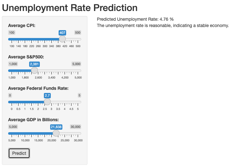{fig-align="center"}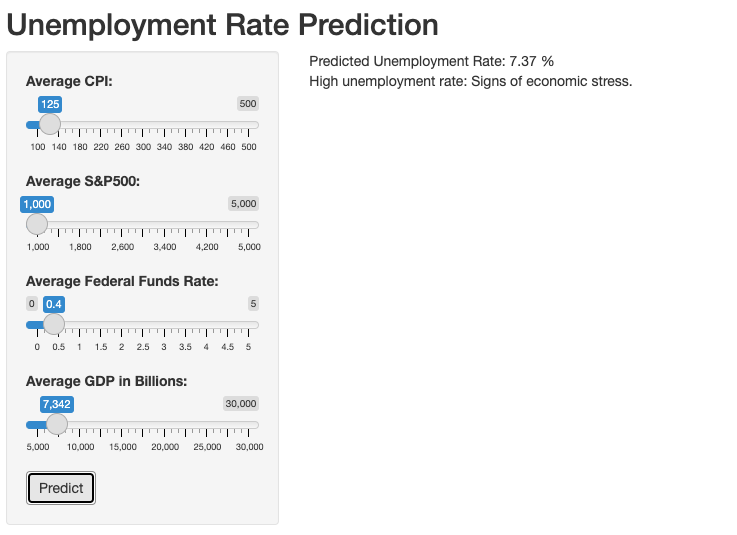{fig-align="center"}# [Conclusion]{.underline}In conclusion, our exploratory data analysis journey delved into the complex interplay between several key economic indicators and their influence on the unemployment rate in the United States. Utilizing both Linear Regression and Random Forest models, we evaluated the predictive power of these indicators.The culmination of this analysis was the creation of an interactive Shiny app, transforming our data-driven insights into an engaging, user-friendly tool. This app allows users to visualize and predict unemployment rates based on key economic variables, thus demonstrating the practical utility of exploratory data analysis in economic research.While our models provided somewhat valuable insights, it's important to acknowledge their limitations. They only scratch the surface of the myriad factors influencing unemployment rates. As such, our findings should be viewed as a stepping stone for more comprehensive analyses in the future, rather than conclusive predictions.# [Appendix]{.underline}## Data Dictionary**Unemployment Data**| Column Name | Description ||---------------------|---------------------------------------------------|| DATE | The date when the unemployment rate was recorded || UNRATE | The percentage representing the unemployment rate on the corresponding date |**Federal Funds Data**| Column Name | Description ||---------------------|---------------------------------------------------|| DATE | The specific date on which the Federal funds rate was recorded || FEDFUNDS | The interest rate at which depository institutions trade federal funds (balances held at Federal Reserve Banks) with each other overnight |**S&P 500 Data**| Column Name | Description ||---------------------|---------------------------------------------------|| Date | The date on which the stock market data were recorded || Open | The price of the S&P 500 index at the opening of the trading day || High | The highest price of the S&P 500 index during the trading day || Low | The lowest price of the S&P 500 index during the trading day || Close | The price of the S&P 500 index at the closing of the trading day |**Consumer Price Index Data (CPI)**| Column Name | Description ||-------------|------------------------------------------------------------|| Year | The calendar year for the data entries || Months | The value of the CPI for each respective month of the year || Annual | The annual average or total value of the CPI |```{r ref.label=knitr::all_labels()}#| echo: true#| eval: false```Attribution: All members contributed equally.


