Mini Project 2: Redesign
Due: 09 March, 11:59 pm
Weight: This assignment is worth 9% of your final grade.
Purpose: At some point in your career, you will likely be involved in creating or revising a summary chart of some data. When that happens, you will also likely be the most knowledge person in the room about what to do to design the chart(s) to effectively communicate the information in the data. This assignment is a practice run for that day.
Assessment: I will use this rubric to grade your submissions.
Background
The American Wind Energy Association (AWEA) is a national trade association that advocates for the wind power industry. They also publish data on wind power statistics in the U.S. The authors of this article at howmuch.net got a hold of some of this data and published this unfortunate chart:
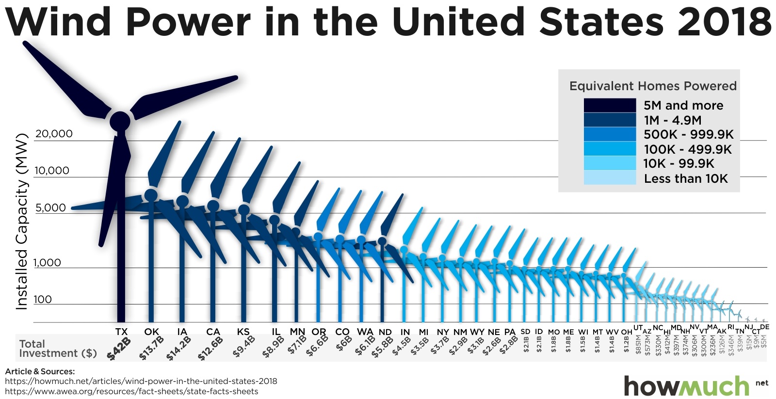
For this assignment, you will use the ggplot2 library in R to redesign the above chart. In this redesign, we are interested in exploring this question: Which states are leaders in wind energy? The answer depends on what you consider a “leader” to be. For example, the authors of the above chart clearly viewed the installed capacity as the most important metric to highlight. But this chart also contains lots of other data, such as the amount of money each state invested and the number of homes powered by wind in each state. Some states may be leading in other ways, such as the capacity built per dollar of investment.
With that in mind, here’s what you need to do for this analysis:
1. Get organized
Download and unzip this
template for your project, then open the project.Rproj
file. The template comes with some text and code explaining how to use
it - delete this code adjust the content in the YAML for your
report.
Use this
link to download the
US_State_Wind_Energy_Facts_2018.xlsx file and put it in
your data_raw folder. Here is some information on the
data:
Description: Data on which US states produce the most wind energy.
Source of downloaded file: The formatted Excel spreadsheet was downloaded from data.world: https://data.world/makeovermonday/2019w8
Original source: The primary source is the American Wind Energy Association (https://www.awea.org/), but the source for this particular data was found on this article, which cites the AWEA: https://www.chooseenergy.com/news/article/best-worst-ranked-states-wind-power/
Data dictionary:
| Variable | Description |
|---|---|
Ranking |
Rank order of state by installed capacity |
State |
U.S. state |
Installed Capacity (MW) |
Installed capacity in MW |
Equivalent Homes Powered |
Number of homes powered by wind power |
Total Investment ($ Millions) |
Total Investment in $ millions |
Wind Projects Online |
Number of projects currently online |
# of Wind Turbines |
Number of wind turbines in state |
2. Preview the data
In the setup chunk in your report.Rmd file, write code
to read in the excel sheet, then write code to preview the data,
e.g. using head(), glimpse(),
View(), and / or make some quick plots
(Hint: look at the top and bottom!). Take note of what
variables are available, their types, what they measure, and if there
are any missing values. (Hint: Read the data
dictionary!) Are all the variables encoded the way you would expect
(e.g. are numbers encoded as numbers?)
3. Clean the data
Write code to modify variable types and names to get your data frame
cleaned up for analysis. As you do so, I recommend that you modify some
of the column names (especially those with spaces in them) to make your
analysis easier. Hint: The rename()
function will come in handy - here’s how you use it:
dataFrame %>%
    rename(
        new_name1 = old_name1,
        new_name2 = old_name2,
        new_name3 = old_name3)
Write a few sentences describing any modifications you made to the original data and why you did it.
4. Summarize the data
Examine measures of centrality and variability in the important variables relevant to our research question. Remember that we’re interested in the states that are “leaders” in wind energy. While installed capacity is an obvious choice to look at, you should also look at summaries of other values, such as the amount of money invested, and at least two other computed measures, such as the capacity per dollar invested (Note: you’ll need to create new variables to do this!). Write a few sentences explaining your summary measures and what you learned from them.
5. Visualize the data
Create an appropriate visualization that highlights leadership in installed capacity. This chart should be a substantial improvement over the original visualization, and it should follow the design principles we have covered in class.
Create a second visualization that highlights “leadership” in another metric of your choice. This could be one of the existing variables or a variable you computed. Your chart and design choices should highlight the metric you chose and should have a clear message to convey. Again, this chart should follow the design principles we have covered in class.
6. Summarize your analysis
Write a summary of your analysis process. I’m specifically looking for a discussion of the following:
- What was wrong with the original chart? Discuss specific design principles we have covered in class.
- Discuss the improvements your first revised chart makes compared to the original chart.
- Discuss what message your second chart conveys and what design choices you made to highlight that message.
7. Knit and submit
Click the “knit” button to compile your .Rmd file into a
html web page, then create a zip file of everything in your R Project
folder. Go to the “Assignment Submission” page on Blackboard and submit
your zip file under “Mini Project 2”.
Page sources:
This assignment is inspired by the assignment “Redesign 1” in Andrew Heiss’s course MPA 635: Data Visualization.
Wednesdays | 12:45 - 3:15 PM | Dr. John Paul Helveston | jph@gwu.edu |
LICENSE: CC-BY-SA