Assignment 4: Wind Power Redesign
Due: 18 February, 11:00 pm
Weight: This assignment is worth 8% of your final grade.
Purpose: At some point in your career, you will likely be involved in creating or revising a summary chart of some data. When that happens, you will also likely be the most knowledge person in the room about what to do to design the chart(s) to effectively communicate the information in the data. This assignment is a practice run for that day.
Skills & Knowledge: In this assignment, you will practice exploring and visualizing a real dataset and to apply some of the graphical design concepts we’ve learned in class to improve an existing chart. This will involve writing text and code to create a reproducible document in the form of an html page.
Assessment: I will use this rubric to grade the finished product.
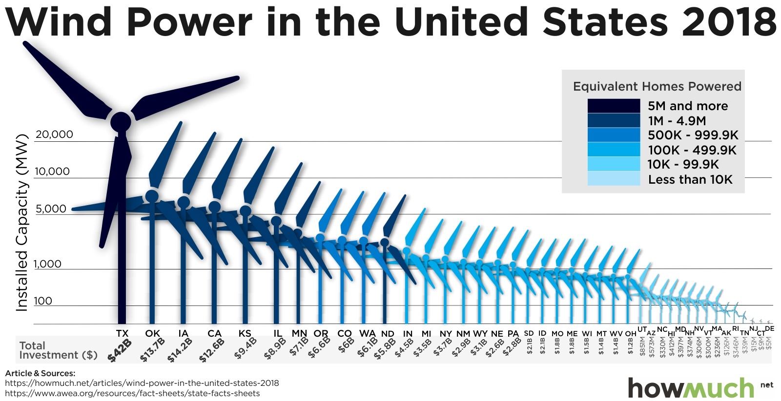
Background: The American Wind Energy Association (AWEA) is a national trade association that advocates for the wind power industry. They also publish data on wind power statistics in the U.S. The authors of this article at howmuch.net got a hold of some of this data and published this unfortunate chart:
Tasks:
For this assignment, you will use the ggplot2 library in R to redesign the above chart. In this redesign, we are interested in exploring this question: Which states are leaders in wind energy? The answer depends on what you consider a “leader” to be. For example, the authors of the above chart clearly viewed the installed capacity as the most important metric to highlight as they used “position on a common scale” to encode this value (albeit along with lots of distracting chart junk). But this chart also contains lots of other data, such as the amount of money each state invested and the number of homes powered by wind in each state. Some states may be leading in other ways, such as the capacity built per dollar of investment.
With that in mind, here’s what you need to do for this analysis:
Download this .zip file. It contains a
analysis.Rmdfile that you should use as a template to write your analysis in, adatafolder with the relevant data needed for this assignment, and aproject.RProjfile to help you stay organized.Clean the data. Read in the file
US_State_Wind_Energy_Facts_2018.xlsxin thedatafolder. Write code to preview the data (Hint: look at the top and bottom!). Take note of the type of each variable and whether there are any missing values. Are all the variables encoded the way you would expect (e.g. are numbers encoded as numbers?) Write code to modify variable types and names to get your data frame cleaned up for analysis. As you do so, I recommend that you modify some of the column names (especially those with spaces in them) to make your analysis easier. Hint: Therename()function will come in handy - here’s how you use it:dataFrame %>% rename( new_name1 = old_name1, new_name2 = old_name2, new_name3 = old_name3)Write a few sentences describing any modifications you made to the original data and why you did it.
Summarize the data. Examine measures of centrality and variability in the important variables relevant to our research question. Remember that we’re interested in the states that are “leaders” in wind energy. While installed capacity is an obvious choice to look at, you should also look at summaries of other values, such as the amount of money invested, and at least two other computed measures, such as the capacity per dollar invested (Note: you’ll need to create new variables to do this!). Write a few sentences explaining your summary measures and what you learned from them.
Visualize the data. Create an appropriate visualization that highlights leadership in installed capacity. This should be an improvement over the original visualization, and it should follow the design principles we have covered in class.
Visualize the data (again). Create a second visualization that highlights leadership in another metric of your choice that you created while summarizing the data. Your chart should highlight the metric you choose and should have a clear message to convey. Again, this chart should follow the design principles we have covered in class.
Write a summary of your analysis process. I’m specifically looking for a discussion of the following:
- What was wrong with the original chart? Discuss specific design principles we have covered in class.
- Discuss the improvements your first revised chart makes compared to the original chart.
- Discuss what message your second chart conveys and what design choices you made to highlight that message.
Click the “knit” button to compile your
.Rmdfile into a html web page.Create a zip file of your whole project (.Rmd, .html, .RProj, and the data folder), then go to the “Assignment Submission” page on Blackboard and submit your zip file.
Page sources:
This assignment is inspired by the assignment “Redesign 1” in Andrew Heiss’s course MPA 635: Data Visualization.
George Washington University | School of Engineering & Applied Science
Dr. John Paul Helveston | jph@gwu.edu | Wednesdays | 12:45–3:15 PM | District House B205 | |
This work is licensed under a Creative Commons ShareAlike 4.0 International License.
See the licensing page for more details about copyright information.
Content 2020 John Paul Helveston